Dunkin'
Promotional Spot — Coffee & Donuts Only
A concept promotional clip responding to Dunkin's rebrand — which removed "Donuts" from their name as the menu expanded beyond donuts. This spot celebrates what made them iconic: coffee and donuts.
A rebrand that left something behind
Dunkin's rebrand removed "Donuts" from their name as their menu expanded well beyond donuts. This promotional clip is a love letter to the original — coffee and donuts, nothing else. A focused, iconic spot for what made Dunkin' Dunkin'.

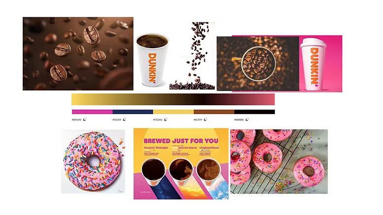
Establishing visual direction
The moodboard set the tone — warm, energetic, bold. Dunkin's signature orange and pink against dark backgrounds, with close-up product shots that emphasize texture and appetite appeal.
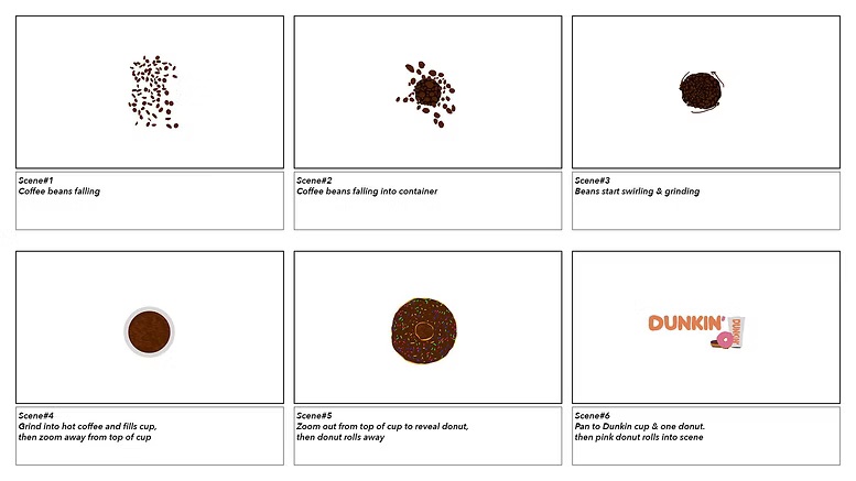
Planning every shot
Storyboards mapped out the shot-by-shot progression — from opening product reveal through the final brand lock-up. Each frame planned for timing, camera angle, and transitions.
The style frame established the final visual look — color, lighting, typography treatment — before full animation began.

From rough timing to final render
Animatics validated timing and pacing before committing to the final render. Two animatic passes refined the rhythm of the spot before final production.
This project demonstrates the full motion design process — from concept and moodboarding through storyboarding, animatic iteration, and final production. Executed entirely in After Effects and Premiere Pro, with a focus on brand alignment and visual storytelling.