05 — Media & Artifacts
Frame process artifacts like evidence
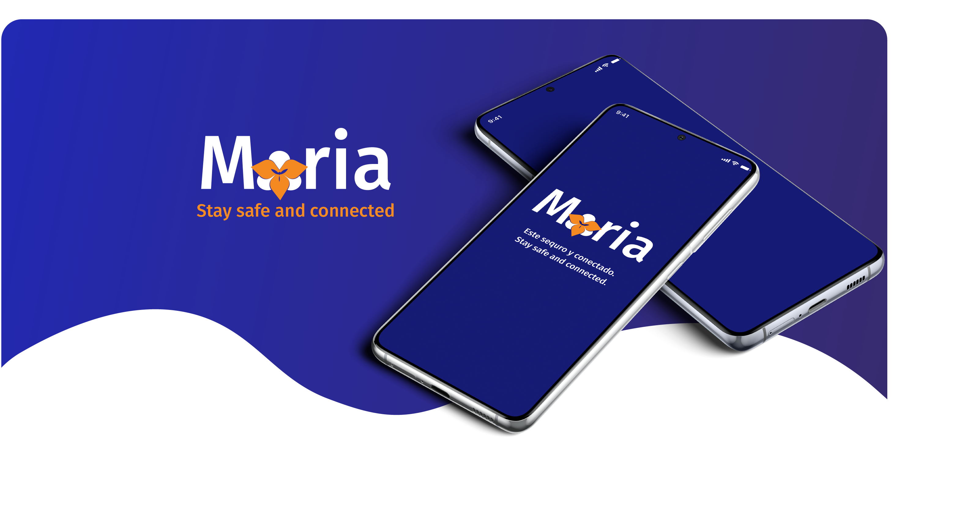
Screens, sketches, prototypes, and videos should sit in consistent frames with restrained overlays and direct captions.
A dark, research-led visual system built for clarity, trust, and evidence-rich storytelling.
This guide documents the portfolio's core visual decisions so new case studies, thumbnails, artifacts, and presentation pages can feel consistent without becoming repetitive.
Structure pages around problem, evidence, process, and outcome. Visual polish should make the work easier to understand.
Use generous dark space, low-contrast surfaces, and restrained motion so case-study artifacts stay central.
Teal accents mark important labels, outcomes, links, and proof points. Avoid using the accent as decoration everywhere.
Show real screens, sketches, journey maps, prototypes, and videos in consistent frames with concise captions.
The palette is intentionally narrow. Dark layers create depth; teal marks meaning, motion, and priority.
Primary page background and visual anchor.
Secondary bands, CTA blocks, and subtle depth.
Alternating case-study sections and process areas.
Headlines, important labels, and high-value content.
Descriptions, captions, body copy, and context.
Links, emphasis, metric highlights, and active states.
Use Syne for hero titles, section headings, metrics, and short emphasis. Keep the weight mostly regular so the tone stays editorial rather than loud.
Use filled teal for primary action. Use tinted ghost buttons for secondary links and contact actions.
Small uppercase labels create hierarchy without adding bulky UI. Tags should be short, scannable, and evidence-based.
Cards combine artifact imagery, project type, concise description, and a low-friction case-study link.
Information architecture work framed through research, testing, and iteration.
Use impact strips, result cards, and outcome boxes when the reader needs the takeaway before the details.
Screens, sketches, prototypes, and videos should sit in consistent frames with restrained overlays and direct captions.
Dark space, measured pacing, and clear copy make complex UX work easier to absorb.
Labels, metrics, and captions should name the work plainly instead of over-explaining.
The portfolio should still feel personal: warm, direct, and rooted in user understanding.