Job Post Redesign — Progressive Disclosure for Faster, More Confident Browsing
Restructuring LinkedIn's mobile job post information architecture — improving scanability, reducing cognitive load, and keeping candidates on platform without disrupting the recruiter workflow.
Users are leaving LinkedIn — and saying why
LinkedIn's mission is to help users find jobs that match their needs, skill sets, and experience. But customers are struggling due to disorganized, inconsistent job posts — causing frustration and pushing them to competitor sites. Goal: introduce accordion-style design so candidates can browse the information that matters to them, increasing retention through higher applicant engagement.
"The job post just feels so busy and each is laid out differently."
Jamie L."I used another site and the job posts were so organized. I really don't use LinkedIn anymore."
Drew C."The current layout of LinkedIn feels like the information is just dumped there."
Charlie M.6 interviews · 45–60 min · Zoom

Lack of thorough or accurate information — not competitor features — drove users away.
- Inadequate descriptions
- Incorrect information

Others prefer Indeed, Otta, Glassdoor, and company websites — LinkedIn is backup, not default.
- Poor job tracking
- Unclear ranking

Scam calls, fake interviews, and fraudulent postings damaged trust and dampened motivation.
- Fake postings
- Security concerns
Core insight: The problem isn't missing content — it's organization. Users aren't missing information; they can't efficiently access what's already there.
Mapping pain points to design opportunities
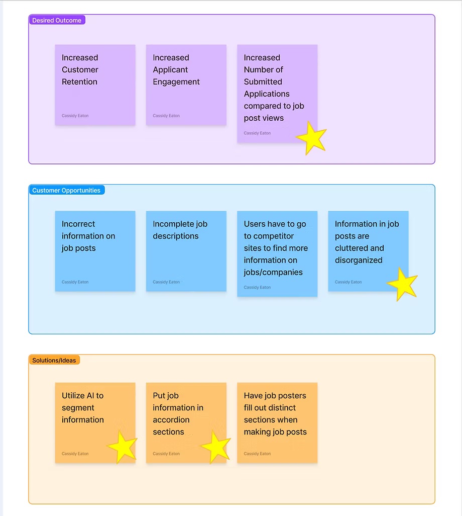
Increase applications submitted vs. job post views.
Users struggle to browse lengthy, disorganized job posts efficiently.
AI parses job post content into accordion sections. Job poster workflow unchanged.
Shows essentials first, reveals details on demand — reduces cognitive load without removing content.
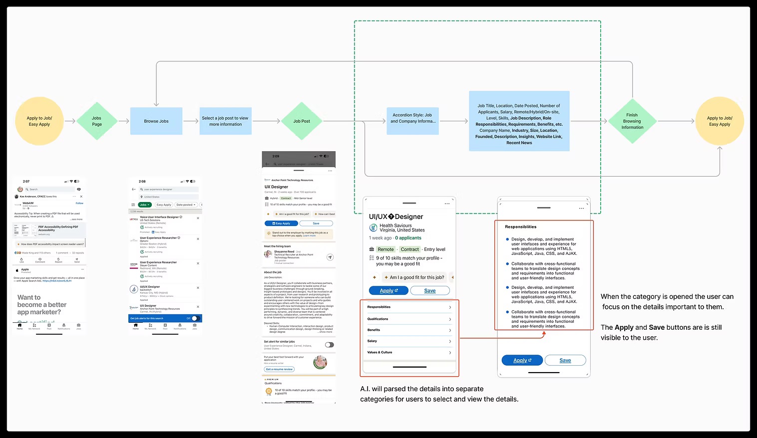
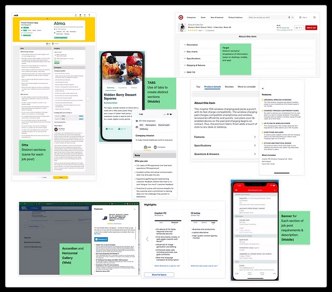
From sketches to hi-fi screens

The layout now keeps both mobile screens in the same visual system: the current long-scroll experience is shown as a constrained phone preview, while the redesigned accordion concept is presented as the annotated design handoff.
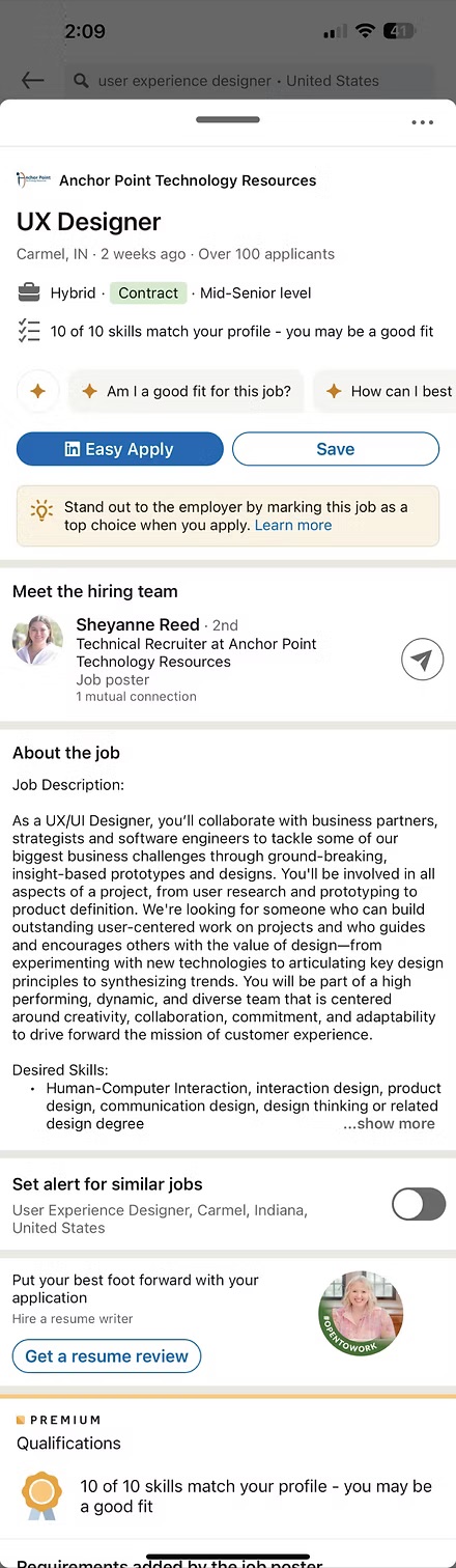
"Information just dumped there"
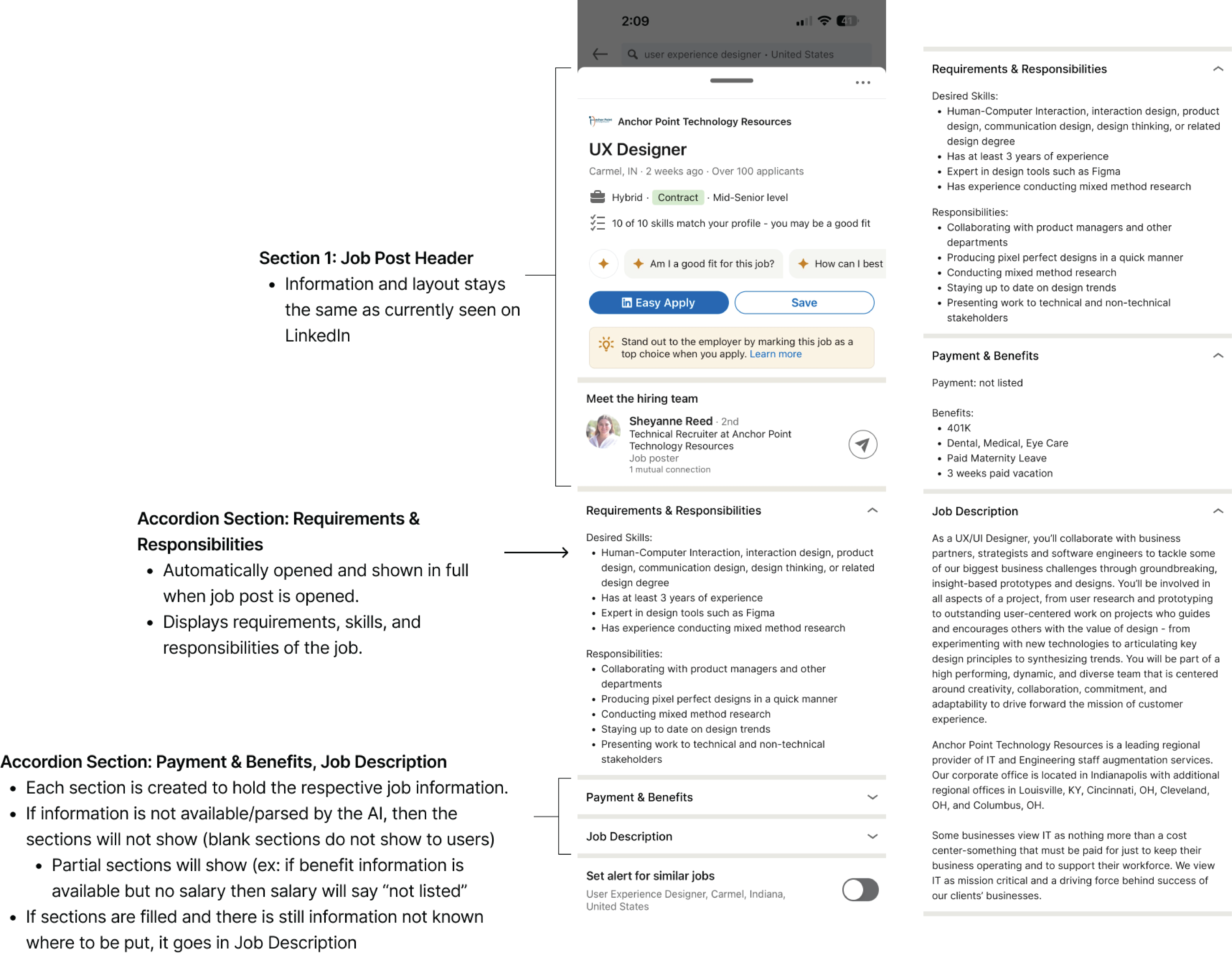
Developer-annotated accordion architecture for implementation handoff
9 tests · unanimous on the accordion
Less is more
Users need less information — but it must be the right information at the right time. Showing everything at once is not thoroughness; it's noise.
Progressive disclosure works
Accordion interfaces effectively manage complex information hierarchies. All 9 participants preferred the sectioned layout — unanimous validation.
Consistency matters
Standardized formatting is as important as content quality. Inconsistency erodes trust before a word is read.
AI as an enabler
Machine learning can solve UX problems without disrupting existing workflows. The recruiter's experience remains untouched.
Want to discuss this project?
I'd love to walk through my research process, design decisions, and usability testing insights.
Get in touch